
Description:
Instagram (October 11, 2021 at 3:40:54 PM UTC)
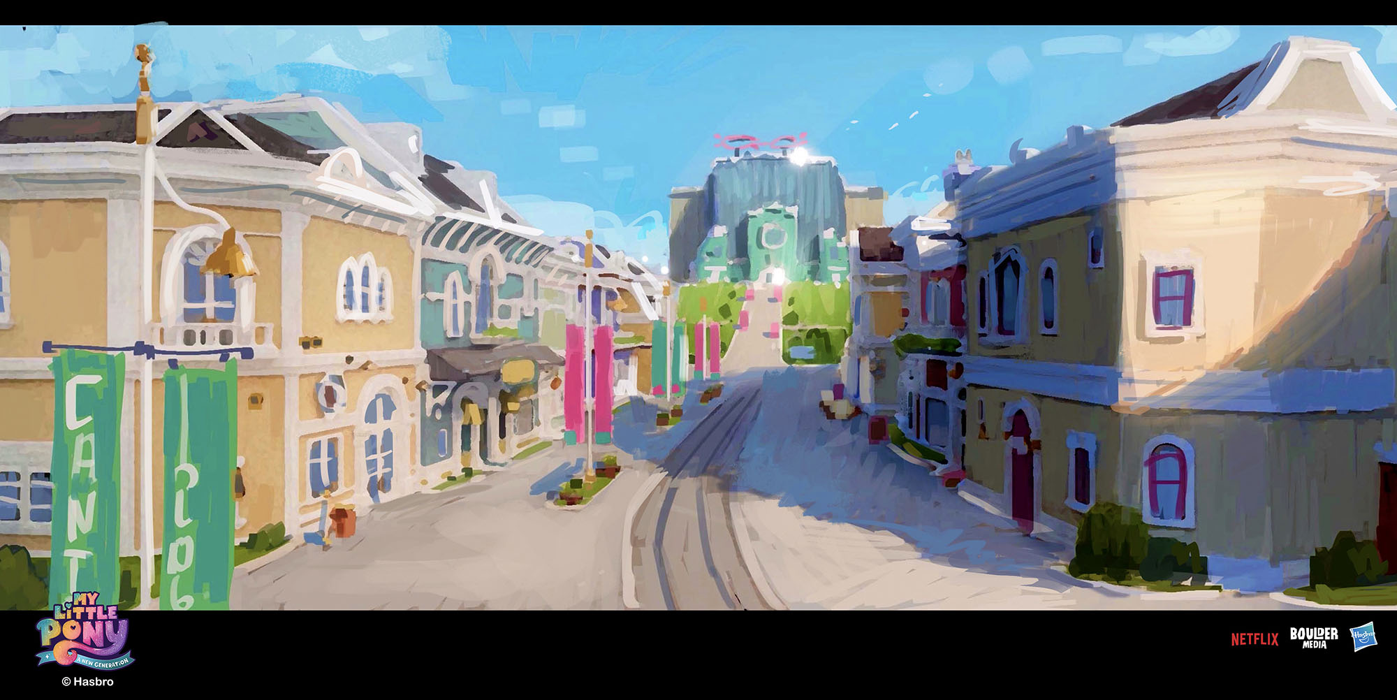
Here are some Maretime Bay rough paintings.
In general this is the more mundane setting in the movie. We wanted it to feel like they really cared about keeping the town neat all the time. The colorfulness was a way to contrast against the propaganda and fear around, as if they are trying to hide behind that facade. As you see in the movie, they really try to protect that.
We used some of Ponyville architecture elements for windows frames, doors and in the top heavy building shapes but we modernized it since a lot of time has passed and we are now in the coast of Equestria.
I wanted the buildings not to align perfectly giving this “in and out” feel. Same for the windows positions. After all, they are not the best in building/making things right? 😁
The factory is overseeing the town. The green part is how it started but after profiting for some time, they builded the rest (glass part).
Fun fact: All doors in the world opens both ways \#mylittleponyanewgeneration \#mylittlepony \#animationart \#art \#sketch
Comments
0 comments posted